09 Sep
Your website’s user experience determines whether visitors become customers or click away to competitors. Research shows that 88% of online consumers won’t return to a site after a poor user experience, making UX design a critical factor in your sales success.
smart UX tips for sales
Apply smart UX tips for sales like clear buttons and fast checkout flows. Boost website conversions fast by making pages easy
smart UX tips for sales
E-commerce UX design helps people shop efficiently and feel confident about their purchases. When your online store appears clean and functions smoothly, visitors develop trust. They locate desired products quickly, navigate seamlessly through your checkout process, and complete transactions without frustration.
Conversely, sites that load slowly, display cluttered layouts, or create confusing navigation paths drive potential customers away. Each abandoned cart represents lost revenue that smart UX improvements can recover.
This comprehensive guide presents 10 actionable strategies to transform your website’s user experience and boost conversion rates. These proven techniques help eliminate visual clutter, guide user attention strategically, and create smooth purchasing flows. You’ll discover how to present the right information at optimal moments through thoughtful design choices.
The strategies outlined below don’t require expensive tools or complete website overhauls. Instead, they focus on intelligent design decisions that work immediately to increase clicks, engagement, and sales. Implement these changes today to start seeing measurable improvements in your conversion metrics.
Streamline Your Navigation Structure
Clear navigation serves as your website’s roadmap, guiding visitors directly to their desired destinations. Complex menu structures with too many options create decision paralysis, causing users to abandon their shopping journey before it begins.
Effective navigation follows the three-click rule: users should reach any product or page within three clicks from your homepage. Analyse your current menu structure and identify redundant categories or overly nested subcategories that complicate the browsing experience.
Create intuitive category names that match how your customers think about your products. Instead of internal jargon or creative names, use terminology your target audience searches for online. This alignment between user expectations and your navigation labels reduces cognitive load and accelerates product discovery.
Consider implementing mega menus for stores with extensive product catalogues. These expanded dropdown menus display multiple categories, subcategories, and featured items simultaneously, allowing users to see all options at once rather than clicking through multiple levels.
Optimize Your Search Functionality
Your internal search function acts as a direct bridge between customer intent and product discovery. Yet many e-commerce sites treat search as an afterthought, missing opportunities to capture high-intent shoppers who know exactly what they want.
Position your search bar prominently in your header, making it easily visible on every page. Use a magnifying glass icon that users universally recognize, and include placeholder text that suggests search terms or popular products.
Implement intelligent search features like auto-complete suggestions, spell correction, and synonym recognition. These features help users find products even when they use different terminology or make typing errors. Auto-complete suggestions also introduce customers to products they might not have considered initially.
Design your search results page to display relevant products with clear filtering options. Include sorting capabilities by price, popularity, ratings, and other relevant attributes. Show the number of results found and highlight the search terms within product descriptions to confirm relevance.
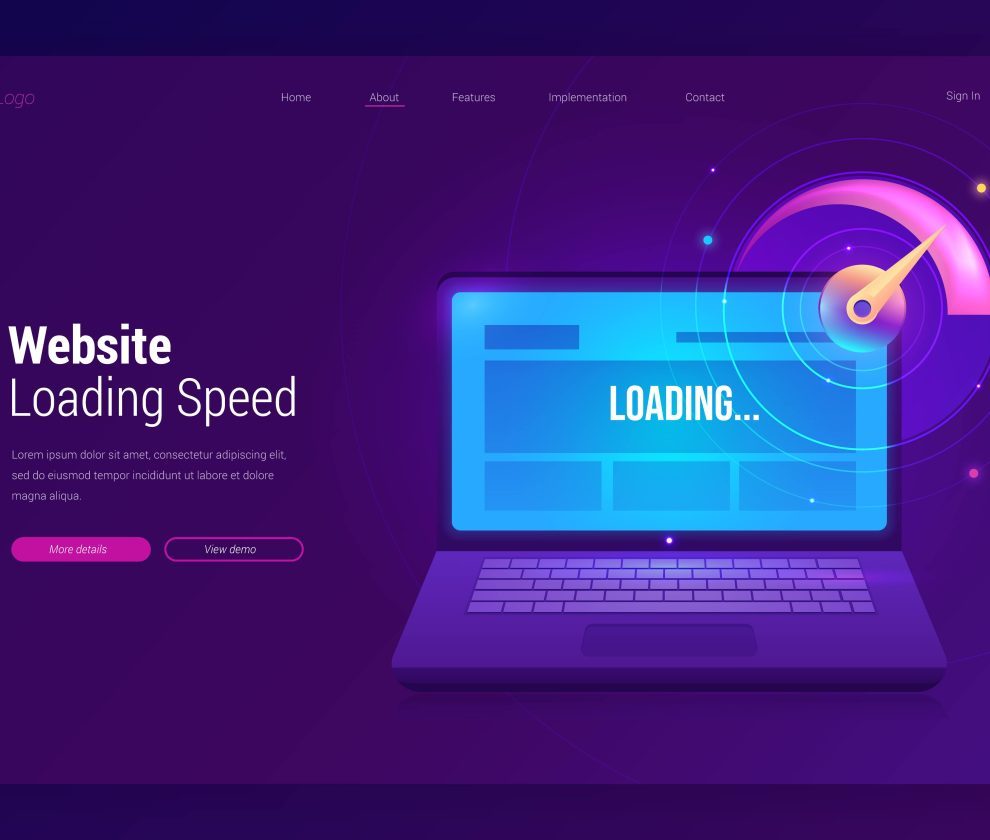
Accelerate Page Loading Speeds
Page speed directly impacts both user experience and conversion rates. Research indicates that a one-second delay in page loading can reduce conversions by 7%, while 40% of users abandon sites that take longer than three seconds to load.
Optimize your images by compressing file sizes without sacrificing visual quality. Use modern image formats like WebP that provide better compression than traditional JPEG files. Implement lazy loading to defer off-screen image loading until users scroll to view them.
Minimize HTTP requests by combining CSS and JavaScript files where possible. Enable browser caching so returning visitors load pages faster. Consider using a content delivery network (CDN) to serve static assets from servers geographically closer to your users.
Regularly test your page speeds using tools like Google PageSpeed Insights or GTmetrix. These platforms identify specific optimization opportunities and track your improvement progress over time.
Design Mobile-First Experiences
Mobile commerce now accounts for over 50% of all e-commerce transactions, making mobile optimization essential rather than optional. Yet many websites still treat mobile as an afterthought, creating frustrating experiences that drive away potential customers.
Start your design process with mobile screens, then scale up to desktop rather than the reverse. This approach ensures your core functionality works perfectly on smaller screens where space constraints demand prioritization of essential elements.
Design touch-friendly interfaces with appropriately sized buttons and tap targets. Ensure interactive elements are at least 44 pixels in height and width to accommodate finger taps accurately. Provide adequate spacing between clickable elements to prevent accidental taps.
Streamline your mobile checkout process by minimizing form fields and offering guest checkout options. Implement mobile payment solutions like Apple Pay, Google Pay, or PayPal Express to reduce friction for mobile shoppers who prefer not to type credit card information on small screens.
Implement Strategic Visual Hierarchy
Visual hierarchy guides user attention through your pages in predetermined sequences, highlighting important information while de-emphasizing secondary elements. Effective hierarchy leads users naturally toward conversion actions without overwhelming them with competing visual elements.
smart UX tips for sales
Apply smart UX tips for sales like clear buttons and fast checkout flows. Boost website conversions fast by making pages easy
smart UX tips for sales
Use size, colour, and positioning to create clear information hierarchies. Make headlines larger than body text, use contrasting colours for call-to-action buttons, and position critical elements in prime screen real estate where users naturally look first.
Create visual breathing room through strategic use of white space. Cluttered layouts overwhelm users and make it difficult to focus on key messages or products. White space directs attention to important elements while creating a sense of elegance and professionalism.
Establish consistent visual patterns throughout your site. Use the same button styles, colour schemes, and typography across all pages to create familiarity and reduce cognitive load as users navigate between different sections.
Optimise Product Pages for Conversion
Product pages serve as your digital sales representatives, providing all the information customers need to make purchasing decisions. These pages must balance comprehensive product details with clean, scannable layouts that don’t overwhelm potential buyers.
Display high-quality product images from multiple angles, including zoom functionality that reveals fine details. Include lifestyle images showing products in use, helping customers visualize how items fit into their lives. Consider 360-degree product views or video demonstrations for complex products.
Write compelling product descriptions that focus on benefits rather than just features. Address common customer questions and concerns directly within the description. Use bullet points to make key information scannable, and include technical specifications in easily digestible formats.
Position trust signals prominently on product pages. Display customer reviews, ratings, security badges, and return policies where users can easily see them. These elements reduce purchase anxiety and build confidence in your brand and products.
Simplify Your Checkout Process
The checkout process represents your final opportunity to convert browsers into buyers, yet it’s also where many e-commerce sites lose customers through unnecessary complexity or unexpected requirements.
Reduce the number of checkout steps by combining related information on single pages where possible. Display a clear progress indicator showing users how many steps remain in the process. This transparency helps users understand the time investment required and reduces abandonment rates.
Offer guest checkout options alongside account creation. Many users want to make quick purchases without creating accounts, especially for first-time purchases or gifts. You can always invite them to create accounts after successful transactions.
Be transparent about all costs upfront, including shipping, taxes, and fees. Unexpected charges during checkout are the leading cause of cart abandonment. Display estimated total costs early in the process and update them dynamically as users make selections.
Build Trust Through Social Proof
Social proof leverages the psychological principle that people look to others’ actions and opinions when making decisions. Strategic implementation of social proof elements throughout your site can significantly increase conversion rates by reducing purchase anxiety.
Display customer reviews prominently on product pages, including both positive and constructively critical reviews. Authentic review collections that include varied perspectives appear more trustworthy than uniformly positive feedback. Respond professionally to negative reviews, demonstrating your commitment to customer satisfaction.
Showcase user-generated content like customer photos, unboxing videos, or social media posts featuring your products. This authentic content helps potential customers visualize products in real-world scenarios while building a community around your brand.
Include trust badges, security certificates, and payment partner logos throughout your checkout process. These visual indicators reassure customers that their personal and financial information remains secure during transactions.
Create Compelling Calls-to-Action
Your calls-to-action (CTAs) guide users toward desired actions, whether that’s making purchases, signing up for newsletters, or exploring product categories. Effective CTAs combine persuasive copy with strategic placement and visual design that demands attention.
Use action-oriented language that creates urgency or excitement. Instead of generic phrases like “Click Here” or “Submit,” use specific, benefit-focused text like “Get Free Shipping” or “Start My Trial.” This approach clarifies the value users receive from taking action.
Design CTA buttons that stand out visually from surrounding elements through contrasting colours, larger sizes, or strategic positioning. However, avoid overwhelming pages with too many competing CTAs that dilute their impact.
Test different CTA variations through A/B testing to identify which combinations of copy, colour, and placement drive the highest conversion rates for your specific audience and products.
Personalise User Experiences
Personalization transforms generic shopping experiences into tailored journeys that feel custom-designed for individual users. Advanced personalization can increase conversion rates by up to 30% by showing users products and content most relevant to their interests and behaviours.
Implement product recommendation engines that suggest items based on browsing history, previous purchases, or similar customer behaviours. Display these recommendations strategically on product pages, in shopping carts, and during checkout to encourage additional purchases.
Create dynamic content that adapts based on user location, device type, or referral source. For example, highlight different product categories for mobile versus desktop users, or showcase region-specific inventory for international visitors.
Use email capture strategies that offer personalized value in exchange for contact information. Instead of generic newsletter signups, offer personalized product recommendations, exclusive discounts, or early access to sales based on user interests demonstrated through their browsing behaviour.
Measuring Success and Continuous Improvement
Implementing these UX improvements requires ongoing measurement and refinement to maximize their impact on your conversion rates and sales performance. Establish baseline metrics before making changes, then track improvements over time.
Monitor key performance indicators, including conversion rate, average order value, bounce rate, and time spent on site. Use heat mapping tools to visualize how users interact with your pages, identifying areas where attention clusters or where users frequently abandon their sessions.
Conduct regular user testing sessions to gather qualitative feedback about your site’s usability. Watch real users navigate your site while thinking aloud about their experiences. These sessions often reveal friction points that analytics data alone cannot identify.
Set up A/B testing protocols to evaluate individual changes before rolling them out site-wide. Test one element at a time to clearly attribute performance improvements to specific modifications. This methodical approach ensures you implement only changes that demonstrably improve user experience and conversion rates.
The digital marketplace continues evolving, with user expectations rising alongside technological capabilities. Regularly audit your site against current best practices and emerging trends to maintain a competitive advantage through superior user experience.
Transform Browsers Into Buyers Today
Smart UX design transforms hesitant browsers into confident buyers through strategic improvements that remove friction and build trust. The ten strategies outlined above provide a roadmap for creating user experiences that guide visitors naturally toward purchase decisions.
Start with quick wins like optimizing page loading speeds and simplifying your navigation structure. These foundational improvements create immediate positive impacts while setting the stage for more advanced personalisation and conversion optimisation strategies.
Remember that UX improvement is an ongoing process rather than a one-time project. User behaviours, expectations, and technologies continue evolving, requiring regular assessment and refinement of your digital shopping experience.
Focus on implementing changes systematically, measuring their impact, and building upon successful modifications. This methodical approach ensures your UX investments generate measurable returns through increased conversion rates and higher customer satisfaction scores.
The competition for online shoppers intensifies daily, but a superior user experience provides a sustainable competitive advantage that’s difficult for competitors to replicate quickly. Invest in UX improvements today to capture more sales tomorrow and build lasting customer relationships that drive long-term business growth.
smart UX tips for sales
Apply smart UX tips for sales like clear buttons and fast checkout flows. Boost website conversions fast by making pages easy